top of page
Christian
Kang

Mega by MegaFood
Synopsis
Responsibilities
This project took place in the span of 14 weeks. This project brief was to create a sub-brand or brand extension to the supplement company Megafood. Using graphic and prototyping skills, I was tasked to create new products that fits with Megafood's organic identity.
Brand Research / Graphic Design / Ideation / Form development / Prototyping / CAD Skills
Duration
Category
2022 - 14 Weeks
Branding & Packaging Design
This project is not affiliated with the brand MegaFood
History

In 1973, MegaFood was born from an unwavering commitment to produce the highest quality supplements available.
Their values focuses in on key core words that guide and fuel their mission to improve the lives of consumers.
"That's Nutrition with Ambition™"
"We're out to change the world, starting with food"
Brand Research
Visual Brand Audit
Product Lines

MegaFood's visual brand audit can be broken down into 5 main parts: branding, certifications, ingredients, values, and commerce.

Large range of medicinal consumables. MegaFood has already tried to update their packaging on their gummy multivitamins as seen above.
Possible Markets
Competitive Positioning

MegaFood has yet to enter the fitness supplement market. This growing space presents an opportunity, as many existing brands lack MegaFood’s values and commitment to regulated, high-quality ingredients.

MegaFood sets the standard for both foundational branding and supplement quality. The objective is to modernize our visual identity while maintaining the superior product quality that distinguishes us from other brands.
Fitness and health
We have to think about why people workout and take fitness supplements. Why would Megafood want to branch into fitness and health? How can we encourage taking Megafoods over competitors?
Fitness Supplements

Why should MegaFood focus on fitness?
Fitness is a growing trend and activity that anyone can join in on. With weight loss, high-intensity interval training, and at home work outs becoming more popular we see a rise in supplement intake.
This is a huge opportunity for MegaFood to branch out into a larger market that is projected to exceed $37 billion globally by 2027.
Reason for Taking

Why do people take fitness supplements?
People take supplements to improve athletic performance, strength and endurance, increase exercise efficiency, set routines, and fill nutritional gaps that support their fitness goals.
Concept Statement
MEGA is a line of dietary/fitness supplements that cater to specific needs that consumers pick out themselves that encourages exercise and selfcare.
The goal is to help users select the all-natural supplements best suited to their needs while emphasizing the brand’s strong foundation in health and farm-sourced quality.
 image |  image |
|---|---|
 final renders already colored.4 |  pitch deck final 2-14_edited |
 final renders already colored.5 |  image |
 final renders already colored.11 |  final renders already colored.3 |
Rebranding and Prototyping
MEGA is a powerful word that describes our aim to be strong and powerful. To keep Megafood's brand identity, logo and graphic developments were made. Using Megafood's brand colors, symbols, and ingredients graphic prototypes were created.
Logo and Form Development


The initial logo development started with digital fonts and ideations. Most ideation was done to convey fitness and wellness. Colors comes from the MegaFood logo seen on all products. Over time experimentation with different combinations, colors, and layouts are used.
Playing around with fonts and alignments
Arm made up of plants to show Megafoods connection with healthy ingredients
Combinations of words and logos
Simplified versions of logos and text


Initial form development started with rough 2D sketches. Ideations made to show how to package 4 different products. Graphics must have similar aesthetic with one another, geometric shapes and large fonts, and colors that symbolize the flavors of each product.
Prototyping


Prototyping to get a sense of sizing (compared to existing products). Created 4 individual packages holding gummies, powders, and liquid. All done with cardboard and laser cut.
Physical Morkups


Printed various design versions for side-by-side comparison and to check sizing and color in the prototype. Able to merge or remove information from each mockup as needed.
Final Rebranding
By considering what's already in the existing market, MEGA will take its own spin on their products. This includes a commanding logo redesign and a line of new fitness supplements. Supplements include a traditional energy drink, a single use pre-work out, protein powder, and gummy vitamins.

Evolution of Logo, Hexagonal border resembles the strongest structural shape found in nature, Muscle shows the connection MegaFood has with its natural ingredients, and Bold typography to convey the strength the branding holds.

Graphics include 3D images of used ingredients, nutrition facts, Certifications icons, and the origin of where ingredients were farmed.

Brand Elements
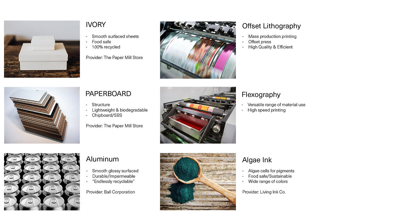
Materials and Printing
Final Renders
The key takeaways include updated visual branding, the introduction of new products, and innovative packaging solutions. Two standout innovations are a cherry-flavored pre-workout offered in a single-use package inspired by instant noodle cups, and a grape-flavored nutrient boost vitamin packaged in beeswax-coated ivory paper, folded to securely hold a hexagon-shaped gummy.
Why hexagons? In nature, hexagons are more common than one might expect. Compared to triangles or squares, hexagonal shapes require the least total wall length, making them one of the strongest and most efficient ways to use space.
This ties in with MEGA's brand identity of nature and strength.


bottom of page